
Turn Raw Data into Insights People Actually Understand
Build interactive charts, reports, and pixel-perfect visual reports with 30+ chart types, drag-and-drop design tools, and one-click embedding, all in a single reporting platform. Works with your existing data sources out of the box.
30-day trial · No credit card required · Cancel anytime
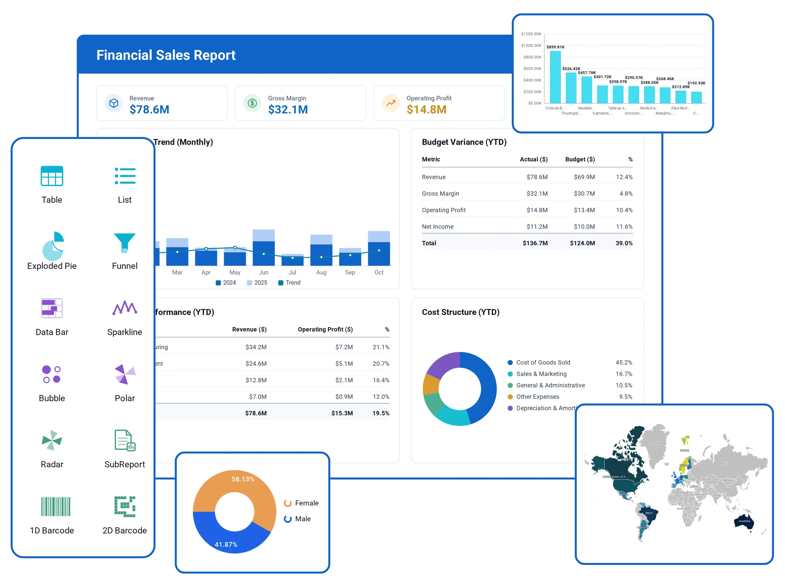
30+
Total visual elements
1-click
Embedding
Live
Data refresh
15+
Data sources
Everything You Need to Visualize Data
Purpose-built tools for charts, reports, and embedded analytics. From RDL and RDLC report design to interactive dashboards, Bold Reports gives your team one platform to visualize data instead of stitching together separate charting, reporting, and BI tools. Every component is built for enterprise-scale datasets and integrates with JavaScript, Angular, React, ASP.NET Core, and Blazor applications.

20+ Interactive Chart Types
From bar and line charts to heat maps, gauges, and maps, pick the right visual for every dataset, with drill-down and tooltips built in.

Drag-and-Drop Report Designer
Compose multi-chart reports visually. Arrange widgets, apply filters, and preview live data without writing a line of code.

Drill-Down Analysis
Let users drill down, drill through, filter, and sort right from the report viewer to explore the data behind a chart.

Real-Time Data Refresh
Connect live data sources and keep reports current automatically, with scheduled or on-demand refresh options.

JS & .NET SDK
Embed with JavaScript, Angular, React, ASP.NET Core, or Blazor components, matching your product's look and feel.

Export Anywhere
Export reports to PDF, Excel, Word, and PowerPoint for offline use or sharing, with layouts that stay pixel-perfect outside the viewer.
30+ Visual Elements in Total, Including 20+ Chart Types
The report designer's full set of data visualization and layout items: 20+ charts, plus gauges, tables, and barcodes.
Charts & graphs
20+ chart types for trends, comparisons, and part-to-whole breakdowns. Help Docs

Column
Compare values side by side across categories.

Bar
Rank long category labels along a horizontal axis.

Stacked column
Show part-to-whole totals across categories.

Line
Track a metric's trend across a time period.

Smooth line
Plot a trend with a curved, less jagged line.

Area
Emphasize the volume under a trend line.

Stacked area
Layer multiple trends into one cumulative total.

Scatter
Plot two variables to reveal correlation.

Bubble
Add a third variable as point size.

Radar
Compare several metrics on one multi-axis view.

Polar
Plot cyclical or directional data around a circle.

Pie
Show each category's share of one whole.

Doughnut
Show proportions with a center free for a label.

Funnel
Visualize drop-off across sequential stages.

Pyramid
Show a hierarchy narrowing toward a point.

Map
Plot data against geographic regions.
Gauges & indicators
Status at a glance, for goals, thresholds, and utilization. Help Docs

Radial gauge
Show a single value against a circular scale.

Linear gauge
Show progress toward a target on a scale.

Indicator
Flag status with a simple icon or symbol.

Sparkline
Show a trend inline without axes or labels.

Data bar
Show a value inline as a mini bar.
Data regions & containers
Structured layouts for detailed records and summaries. Help Docs

Table
List detail rows in a simple flat layout.

List
Repeat a custom layout once per record.

Matrix
Cross-tabulate rows and columns.

Tablix wizard
Build a table, list, or matrix step by step.

Subreport
Embed one report inside another.
Barcodes & inputs
Scannable codes and signatures for secure data capture. Help Docs

1D barcode
Print a standard linear barcode on a report.

2D barcode / QR
Encode more data in a scannable QR code.

Signature
Capture or display a signature field.

PDF import
Insert pages from an existing PDF file.

HTML import
Render formatted HTML in a report.
Why Teams Embed Bold Reports
Building a charting and reporting layer in-house means owning chart rendering, cross-filtering, and SDK maintenance indefinitely. Embedding Bold Reports gives you the same data visualization capability out of the box, with updates and browser support handled for you.
| Capability | Build in-house | Bold Reports |
|---|---|---|
| 20+ pre-built chart types | – | ✓ |
| Multi-tenant, white-labeled embedding | Manual | ✓ |
| Drill-down and cross-filtering | – | ✓ |
| JS/.NET SDK with React & Angular components | Custom | ✓ |
| Ongoing chart engine maintenance | – | ✓ |
From static numbers to a live report
Most teams don't lack data, they lack a fast way to see it. Numbers sit scattered across spreadsheets, CRMs, and internal systems. Every new chart means exporting a CSV, pinging a developer, or waiting on whoever owns the reporting tool. By the time a report is ready, the decision it was supposed to inform has already been made without it.
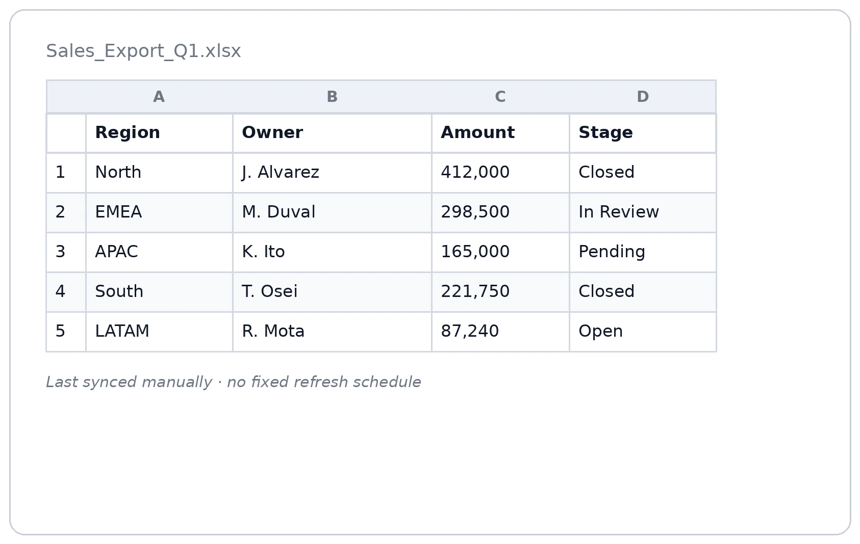
The same data renders as a live report, giving everyone a clear view of the latest information. Figures update automatically on schedule, so there’s no need to manually refresh, export, or resend files. Everyone with access opens the same current version, keeping reporting consistent and eliminating outdated or duplicate copies of spreadsheets.
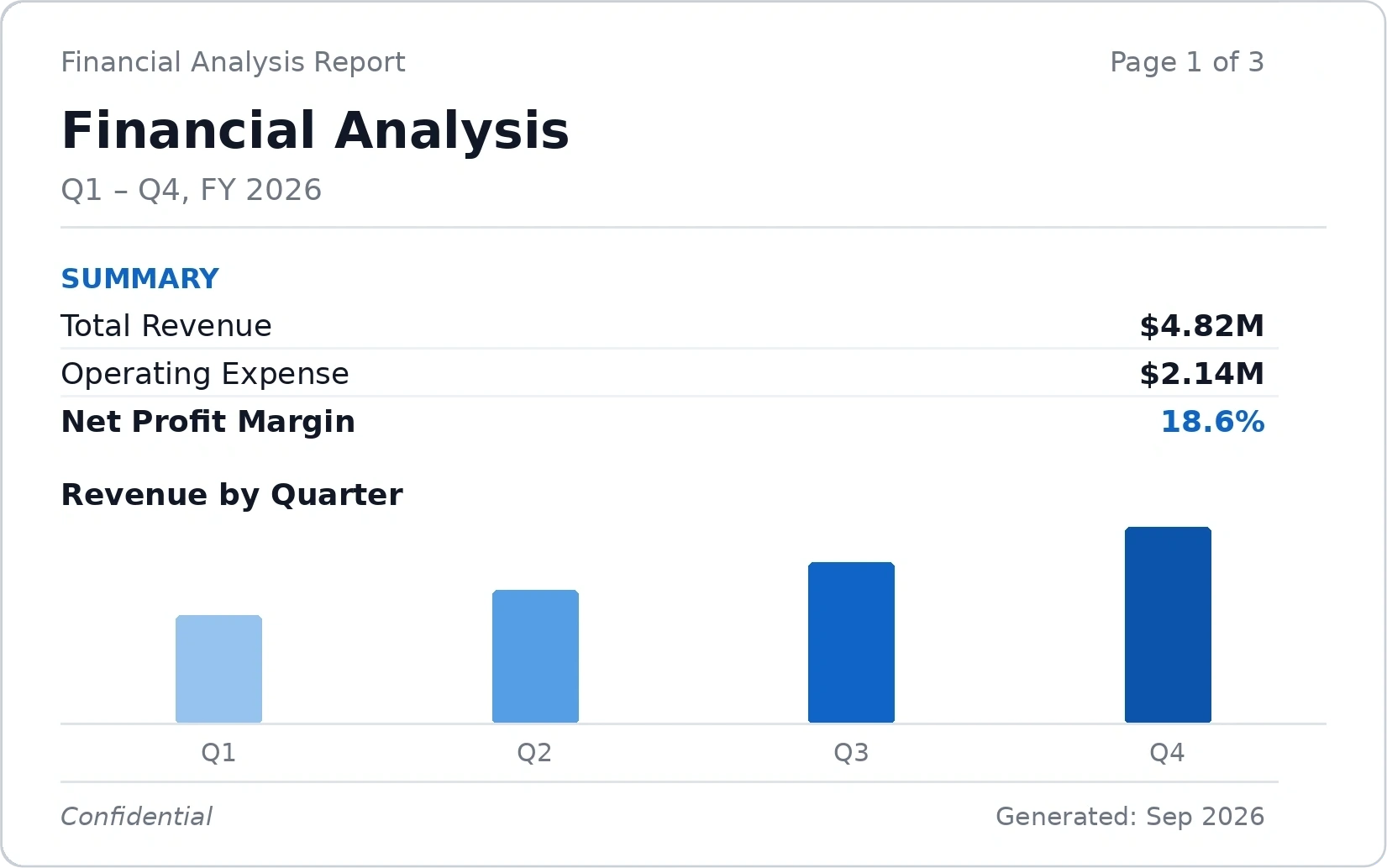
Four things that make it work in practice
Each capability, and what it looks like in the product.
See patterns a table of numbers would hide
Choose from a wide range of chart, map, and widget types, from standard bar and line charts to gauges, heat maps, and geo maps, and customize colors, drill-downs, and filters without touching code. A report nobody can read doesn't get used.
-
Drag-and-drop chart builder, no SQL required for a first working visual
-
Drill-down and cross-filtering across every chart on the report
-
Conditional formatting and thresholds highlight what matters without a second look
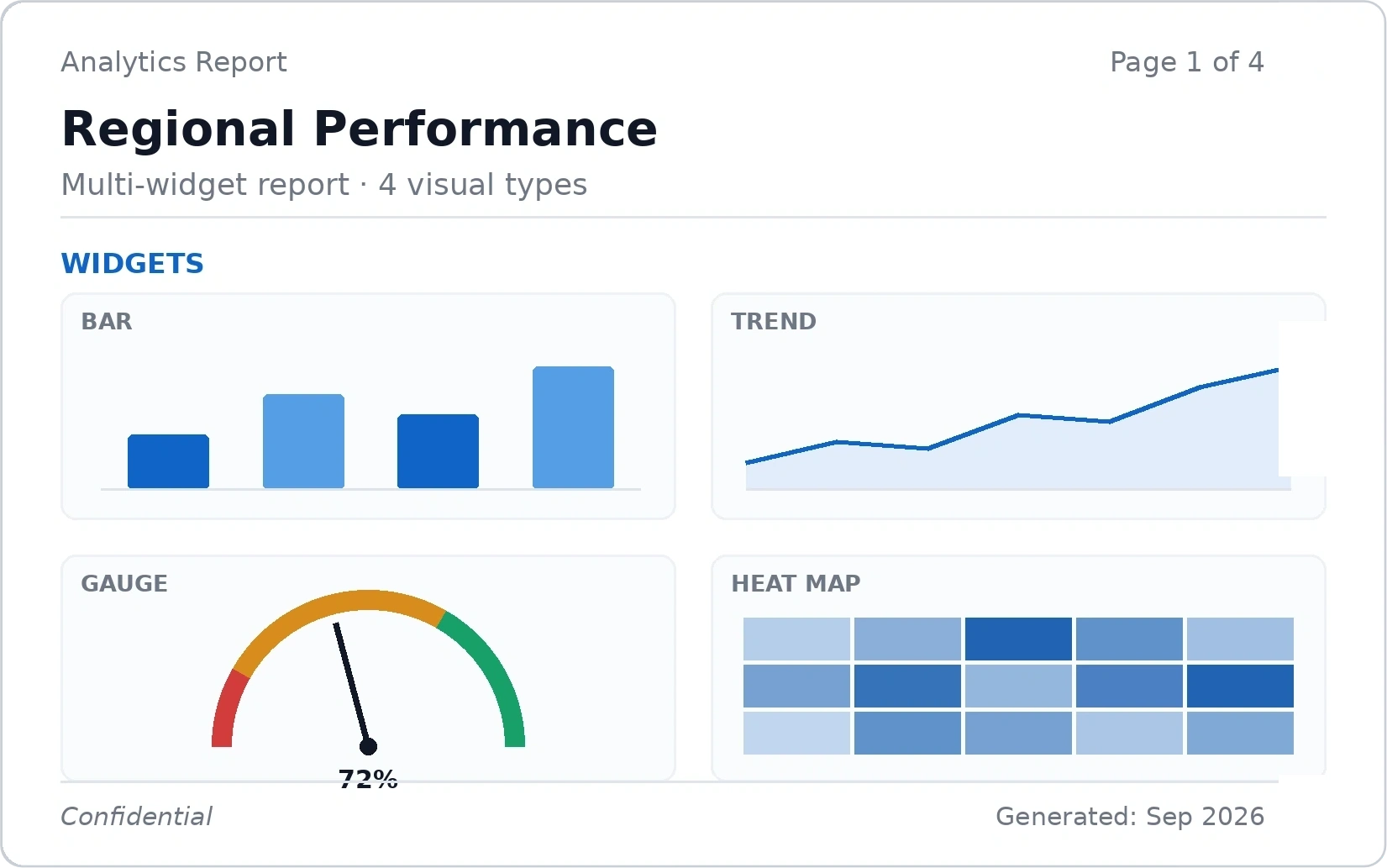
Every data source, one report
Bold Reports connects to 15+ built-in data sources, relational databases, cloud data warehouses, NoSQL stores, and REST/OData services, plus 250+ additional systems through the CData driver library. Connect once through a shared data source, and every report built on it stays live.
-
Shared data sources, one configured connection reused across many reports
-
Credentials and access rules live in one place, not copied into each report
-
Cloud, Managed Private Cloud, or on-premises, the same connectors either way
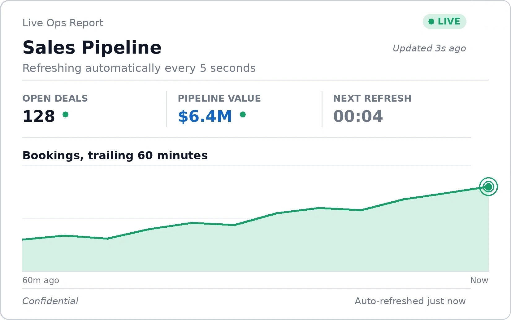
Know what's happening now, not last week
Reports refresh automatically as underlying data changes, so operations and sales teams look at the current state of the business instead of last Monday's export. Set the refresh cadence per report, live streaming views for ops monitoring, scheduled refreshes for exec summaries.
-
Live data refresh, no manual re-export, no “is this the latest version?”
-
Role-based reports so each team sees its own metrics, updated automatically
-
Works for a single live ops screen or a finance team's daily-refresh KPI view
Built for the person who isn't a developer
Business users build their own reports with a drag-and-drop designer, no query, no data model, no ticket in the dev backlog. IT stays in control of data access and security; everyone else stops waiting on IT for a new chart.
-
Role-based and row-level security, so self-service isn't unrestricted access
-
Shared report templates so teams aren't rebuilding the same report
-
IT keeps visibility into what's published, without owning every request
Pick a data source
Choose an existing connection, no new query to write.
Drag fields onto the canvas
Build the layout visually, charts, tables, and filters snap into place.
Publish and share
The report is live for your team, with IT-controlled access underneath.
Frequently Asked Questions
Bold Reports includes 20+ built-in chart types, such as column, bar, line, area, scatter, bubble, radar, pie, doughnut, funnel, pyramid, and map, plus gauges, indicators, data bars, and sparklines, all with drill-down and interactive tooltips.
Yes. You can embed charts, tables, and other report visuals into your web application through Bold Reports' embedding options and SDKs for JavaScript, Angular, React, ASP.NET Core, and Blazor.
No. The drag-and-drop report designer lets you build multi-visual reports without writing code, though calculated fields, expressions, and APIs are available for custom workflows.
Yes. Use color rules, gradients, and logic-based formatting to highlight key trends or thresholds directly on a chart.
Yes. Users can drill down, drill through, filter, sort, and hover over visuals to explore the data behind a report, right from the report viewer.
Yes. You can connect live data sources and configure automatic or on-demand refresh so reports always reflect current data.
Bold Reports connects to 15+ built-in data sources, including SQL Server, PostgreSQL, MySQL, Oracle, Snowflake, BigQuery, and MongoDB, plus 250+ more through the CData driver library.
Yes. Shared data sources let you configure a connection once and reuse it across multiple reports without reconfiguring it each time.
Yes. Report design tools support custom themes, colors, fonts, and layout styles so visuals match your organization's brand.
Bold Reports ships a rich built-in visual library, and you can extend it with calculated fields, expressions, and advanced formatting for cases the built-ins don't cover.
Yes. Reports export to PDF, Excel, Word, and PowerPoint with every chart, gauge, and table rendered as designed.
Yes. Bold Reports is built to process large volumes of data efficiently, so report performance doesn't degrade as datasets grow.
Start Visualizing Your Data Today
Turn spreadsheets and scattered data into interactive charts, gauges, and pixel-perfect reports your whole team can read at a glance.
30-day trial · No credit card required